

Redesigned and launched a feedback collection system for service desk
employees reducing workflow time by 67%.
Role:
UX Designer
Timeline:
7 months
Team:
Design Manager, PM
Company:
Wegmans Food Markets
Overview:
Wegmans Service Desk staff were juggling four overlapping feedback forms, so slow that employees skipped them and customers walked away.
I redesigned the workflow into a single adaptive form, and discovered along the way that the real problem wasn't the interface. It was the data strategy behind it.
My responsibilities:
Research about the existing feedback collection system.
Revamp the workflow.
Collaborate with stakeholders in the process.
Impact:
2X
Monthly feedback volume
67%
Faster to complete, translating directly at the desk.
7
Months to launch a new system
Four redundant forms made giving feedback so painful that people stopped.
Forms were painful enough that employees skipped them, leaving leadership blind to store-level issues.
Service desk employees were facing an issue carrying out rest of the responsibilities at their shift.
Shoppers willing to give feedback gave up over the wait.

25 interviews with customers and service desk employees cleared pain points and how it affects workflow.
Every form had overlapping information which emplo.
Required fields that didn't apply forced staff to type "N/A" just to pass validation, corrupting the data that did get collected.
The Illness form was the worst offender ,invasive, intimidating, refused


It was not the UI problem,
I ran moderated usability studies with Service Desk employees to audit the workflow.
The finding reset the entire project: 70% of the form fields were low-impact,
collected at the desk but never used in any follow-up.


I asked the Customer Care Center's lead to rank each field in order of importance according to which fields will help with follow-ups.
I had to dismantle the silos creating the bloat, and presented the audit to Corporate Leadership, Customer Care, and Legal.
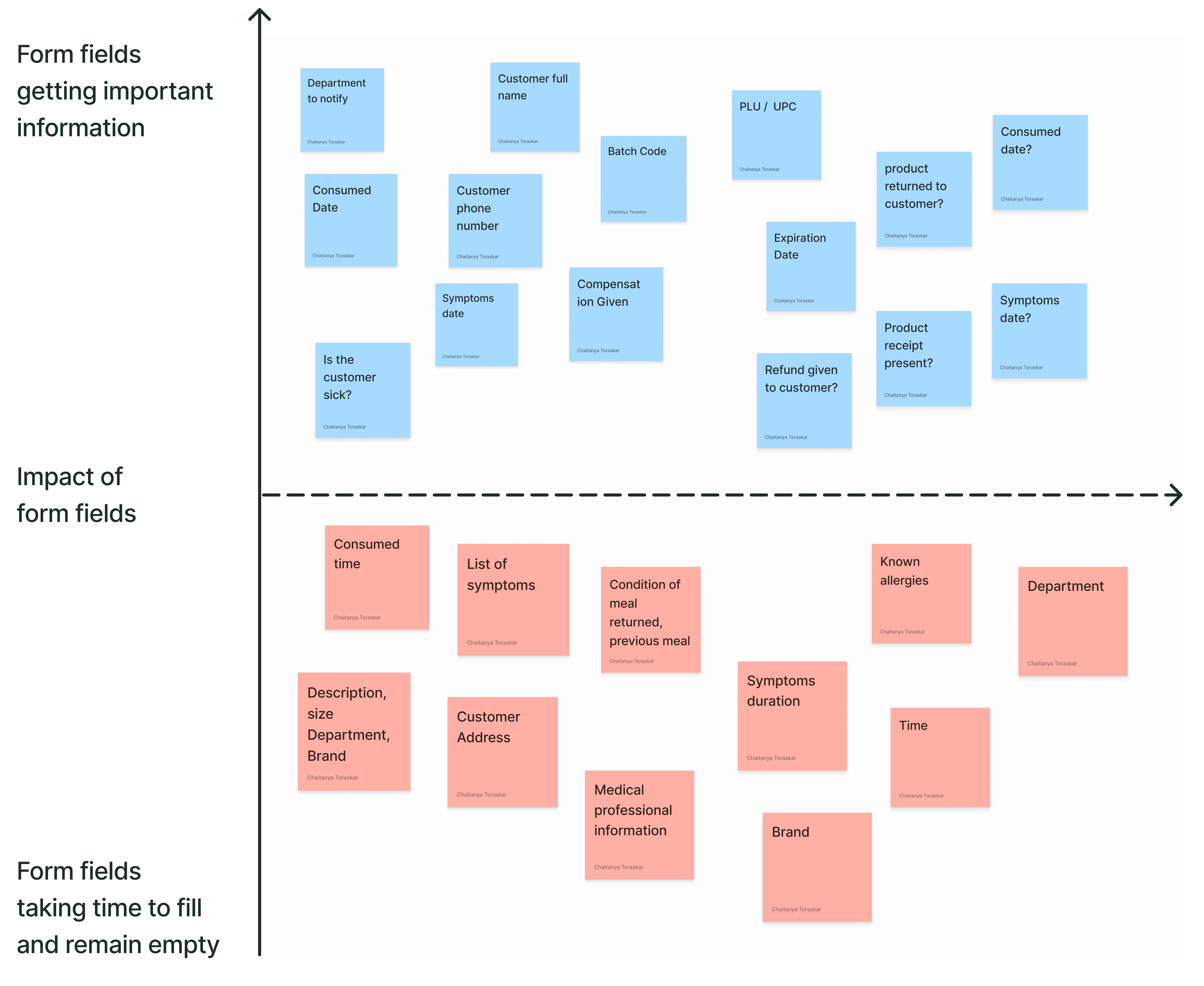
Legal team pushed back on removing personal customer info, I used quantitative data to back my reason.
Legal team said that they had to follow the regulations for a product not working.
I pulled out a week's data showing how many customers filled out the personal information fields
I showed them the current time it takes to fill the long form.
Presented the quotes said by customers and employees about the personal fields asked.


With requirements cut, I rebuilt the feedback system into one adaptive flow.
I started off with designing an information architecture that streamlines the entire feedback collection system.
Understood how the users preferred giving various feedbacks.
Mapped out when a specific fields would open up.
Each field only captures the most important information for customer care center to follow-up.

Designed for speed and error-prevention in a crowded, noisy
environment
Each decision below was a trade-off, not a default.
Google.com
Store
Feedback Form
Name: Chaitanya Toraskar
Date: 07/24/2024
Time: 9:15 PM
Store No: 48245 Main Office
Feedback Type
Feedback Type
Comment
Compliment
Cancel
Submit
The simplest feedback
Compliments, the most common feedback, are
the default screen on open

Progressive disclosure
Rather than showing every field at once, the form adapts in real time
Radio buttons over dropdowns
Most fields were binary (Yes/No) but built as dropdowns. Converting
them to radios cut clicks on those fields by ~50%.
The Illness form, folded in
It's a standard Product Complaint that only triggers sanitised
follow-ups when "customer fell sick" is checked, the the Legal win unlocked..
I designed some confirmation screens to help
service desk employees know if the feedback was collected.


One point in research talked about employees at service desk having facing frequent miscommunications with Customer Care.
Customer care were not following up with service desk employees asking about the product.
Employees would often keep the product with them for weeks or even months.
The product would start stinking with bad smell pollution the service desk area.

I designed a communication dashboard which tell employees
everything about their feedbacks and products

Employees can watch all the information regarding
the feedback they collect.

Dashboard helps them directly message to the
customer care center asking them about a particular case.
Tested the new system in our pilot stores over a month.
We tracked performance over a 30-day post-launch window. Lowering the barrier
recaptured data that had previously been lost, and a shorter form meant shorter lines

"My task has become so much easier with this redesign."
The new feedback system significantly improved collection
time and workflow for service desk employees.
2X
Monthly Feedback Volume
67%
Faster to collect feedback
7
Months to launch a new system
People still have to go all the way to the
service desk to give feedback
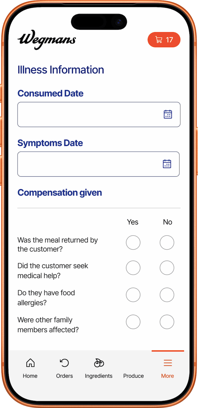
I'd build a responsive version of the feedback form which people could
fill it from the phone itself which would save time.

See my other projects.


Design System
SaaS System
UI Design
Built and maintained a design system that scaled across 4 different VR training simulators.


Retail
Onboarding UX
Redesign
Designed a new loyalty-program flow with 70% of the non-member shoppers agreeing to sign-up.