CT
AI Product
Jun 2026
Redesigned enterprise feedback form cutting form fill time by 67% and doubling monthly feedback volume.
Context
Wegmans Service Desk staff were juggling four overlapping feedback forms, so slow that employees skipped them and customers walked away.
I redesigned the workflow into a single adaptive form, and discovered along the way that the real problem wasn't the interface. It was the data strategy behind it.
Impact
2X
Monthly feedback volume, data that was previously being lost entirely
67%
Faster to complete, translating directly into shorter lines at the desk
Problem
Four redundant forms made giving feedback so painful that people stopped.
The Service Desk is high-traffic and high-stress. To log a single piece of feedback, an employee chose between four separate forms like Store Comment, Customer Comment, Product Complaint, and a standalone Foodborne Illness report, each long, each with forced fields and no smart defaults.
01
Loss data
Forms were painful enough that employees skipped them, leaving leadership blind to store-level issues.
02
Polluted data
Required fields that didn't apply forced staff to type "N/A" just to pass validation, corrupting the data that did get collected.
03
Customer drop-off
Shoppers willing to give feedback gave up over the wait. The Illness form was the worst offender ,invasive, intimidating, refused.


The reframe
Turn four forms collecting data nobody used into one form that's fast at the desk and useful downstream.
The Process & Discovery
The reframe: it was never a UI problem.
I ran moderated usability studies with Service Desk employees to audit the workflow. The finding reset the entire project: 40% of the form fields were low-impact, collected at the desk but never used in any follow-up. Three departments had each bolted on their own requirements over the years, with no one coordinating
So before designing a single screen, I had to dismantle the silos creating the bloat, and presented the audit to Corporate Leadership, Customer Care, and Legal.
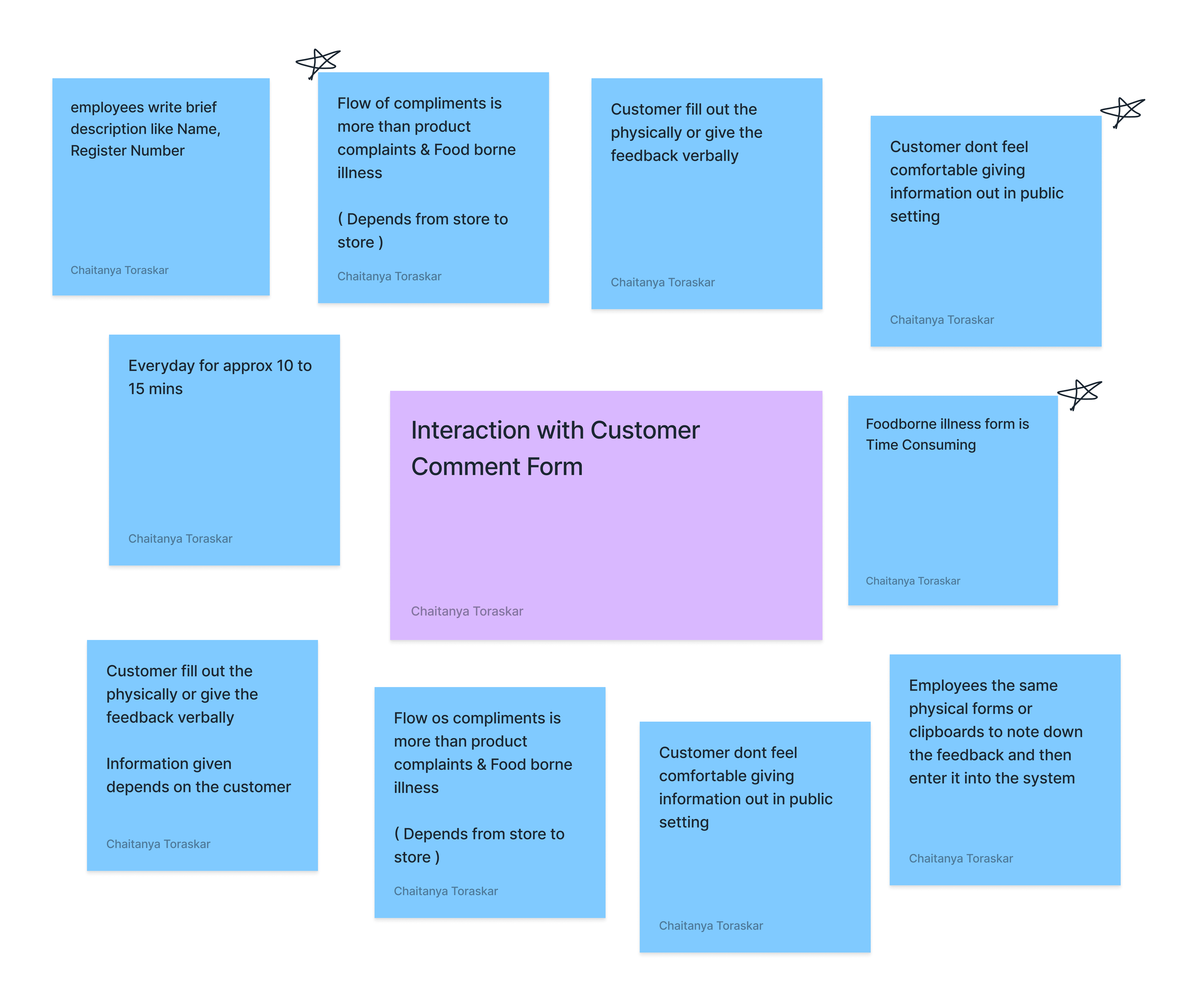

The two negotiations that made the redesign possible

We split every input into High vs. Low Impact. I argued for stripping the desk form to essentials and shifting Low-Impact collection to the Customer Care Center's follow-up call — killing the redundancy of CCC re-asking what the form already captured.

I made the case to pull invasive medical questions out of the initial intake. Legal agreed to surface them later, sanitised — lowering the barrier for customers to report a safety issue at all.
I successfully convinced Legal to remove invasive medical questions from the initial intake, lowering the barrier for customers to report safety issues.

Solution — The Smart Form
With requirements cut, I rebuilt it into one adaptive form
With the requirements simplified, I started off with designing an information architecture that streamlines the entire feedback collection system.

Designed for speed and error-prevention in a crowded, noisy environment. Each decision below was a trade-off, not a default.


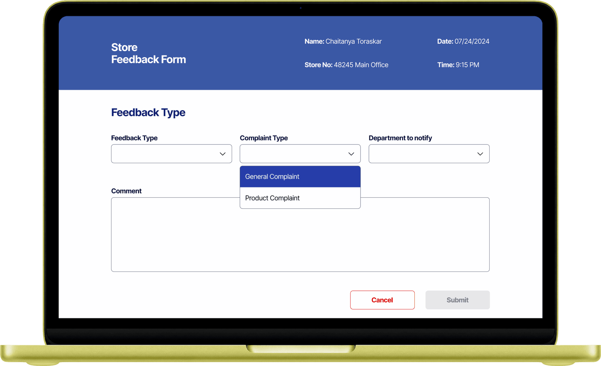
Decision 01
Progressive disclosure
Rather than showing every field at once, the form adapts in real time. Compliments, the most common feedback, are the default screen on open.
Decision 02
Radio buttons over dropdowns
Most fields were binary (Yes/No) but built as dropdowns. Converting them to radios cut clicks on those fields by ~50%.
Decision 03
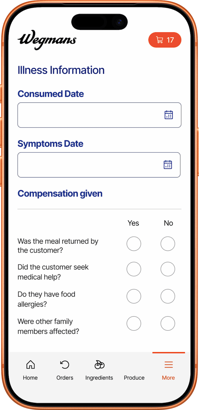
The Illness form, folded in
No longer separate. It's a standard Product Complaint that only triggers sanitised follow-ups when "customer fell sick" is checked, the the Legal win unlocked.
Decision 04
Distinct success states
In a loud, fast space, staff need to know they're done. Clear success states give immediate cognitive closure, ready for the next customer.


Result — 30-day post-launch
The "less is more" bet held
We tracked performance over a 30-day post-launch window. Lowering the barrier recaptured data that had previously been lost, and a shorter form meant shorter lines. It landed with the people who actually use it, too
2× monthly volume.
67% faster to complete.
"My task has become so much easier with this redesign."
— Service Desk employee, post-launch

What I'd build next
A two-way status dashboard letting Service Desk staff track a complaint to "Closed",
so they know when it's safe to dispose of a physical product, keeping the desk sanitary and closing the loop end-to-end.

What I Learned
01
The interface is often a symptom
The real win came from fixing the data strategy upstream, not from prettier fields..
02
Designers can negotiate requirements
The Customer Care and Legal conversations moved the metrics more than any single screen. That's the part of the role I want more of.
03
Validate with the actual users
Testing with real Service Desk employees, not stakeholders, is what confirmed the redesign worked before launch.
