CT
AI Product
Jun 2026
The design system behind a VR platform built for a TV remote
Context
Six VR simulators, each built as its own app, no shared visual language, and a solo designer handing off to engineering in twelve weeks.
I built a token-and-component system the developers shipped directly from, designed focus-state-first, because on a D-pad the focus ring is the cursor.
Result
1
System replaced 6+ standalone apps
[N]
Reusable components across flow + dashboard
Shipped
Developers built the
product directly from it
Problem
There was no system, just six apps that shared nothing
Each simulator had been designed and built on its own: no shared components, no shared vocabulary between design and engineering, no guarantee a button behaved the same way twice.
As the only designer handing off in a 12-week window, I couldn't spec every screen from scratch.
01
No shared language
Without a system, every component is a separate conversation with engineering, and that doesn't fit in twelve weeks.
02
The constraint multiplies inconsistency
On a TV driven by a remote, focus, sizing, and contrast must be identical on every screen, or the D-pad experience breaks.
03
Scale was the goal
Six trainings today, more later. That only works if screens are assembled from a library, not hand-built.
Principles
Four rules that govern every decision in the system
Focus comes first
If an element can't show focus clearly from six feet, it doesn't ship. Every interactive part is designed focus-state-first.
Glanceable at 4–6 ft
Type, target size, and contrast are scaled for the room, not for arm's length.
One choice per screen
Components favour a single clear decision, the cleanest way to lower
D-pad cognitive load.
Colour means something
Teal and red carry fixed roles across the whole system. Colour is never decorative.
Foundations — Tokens
The primitive layer everything is built from


Type scale

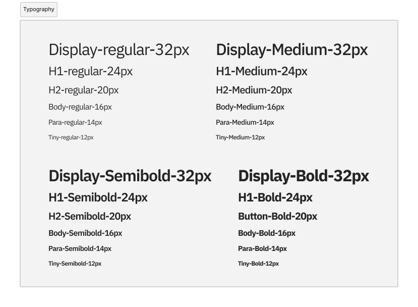
Type scale

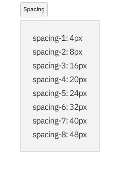
The Focus System — the foundation
On a D-pad, there is no cursor. The focus ring is the cursor.
That single fact reorganises the whole system: focus stops being a state you add at the end and becomes the thing everything else is built on.
Every interactive component carries the same focus treatment, a scale-up, a red highlight, a controller hint, so a focused card and a focused checklist item behave like one family.


Components
The library, each component with its states




Composition
One system, two very different surfaces
The proof that it's a real system: the same tokens and components produce both a lean, sequential flow and a dense, data-heavy dashboard

Lean and sequential, built from Focusable Cards and the Stepper, identical focus rules at every step.

Dense and data-heavy, same tokens, same badges, same checklist, drawn from the one library.
Handoff & Adoption
The system was the
contract with engineering
Components were named and specced so developers built from them directly, instead of reverse-engineering each screen. In a twelve-week window, that's what kept the dense dashboard and the multi-step flow consistent

Impact
System outcomes, with
field results as proof
Components were named and specced so developers built from them directly, instead of reverse-engineering each screen. In a twelve-week window, that's what kept the dense dashboard and the multi-step flow consistent
01
One system replaced 6+ bespoke apps
A single shared language across every training.
02
[N] reusable components
Carried both the selection flow and the analytics dashboard.
03
Shipped inside the 12-week window
The system is what made hitting that deadline possible.
04
90% task completion · 4.8/5 across 50 officers
Downstream proof the system held up in the field, on real hardware.
What I Learned
01
Focus visibility is the foundation, not a detail
On a D-pad, get the focus system right and the rest of the library has somewhere to stand.
02
A design system is a
communication tool first
It was the shared language that let a solo designer hand off a full platform to engineering in twelve weeks..
03
Semantic colour makes
density readable
Teal and red meaning the same thing on every screen is why officers could read a dense dashboard at a glance.
